Example: How to create a population chart (time series) for the municipality of your choice
Step 1 of 5: Open CentropeSTATISTICS – click on the CentropeSTATISTICS button on the left in the CentropeMAP geoportal
Perhaps you receive a warning: "You are entering the CentropeSTATISTICS expert mode. This tool requires basic knowledge in statistics, mapping, and cartography, and uses cookies." if you are here for the first time or after a longer period of time not using CentropeSTATISTICS. Press "OK" to continue.
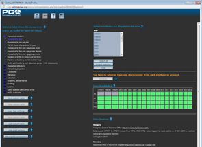
Step 2 of 5: Select the population table from the cross-border statistics database. Open the "Population numbers" folder by a single click, then click "Population by year". (Fig. 1 below) Select any year to be displayed from the right half of the window. (As we want to create a time series chart, all years available will be used, so the choice of year does not matter at the moment.) You will see the message "Map or chart creation possible (click "Continue" button below)." – just click "Continue" to go to the table view.
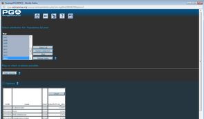
Step 3 of 5: Switch from table view to chart creation. Click the chart button on top of the table column "population_abs". (Fig. 2 below) You are now taken to the chart creation window.
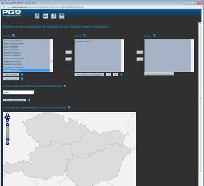
Step 4 of 5: Select one or more municipalites for your chart, either by selection from the text box or using the map. Click "Show values by year" when done. (Fig. 3 below)
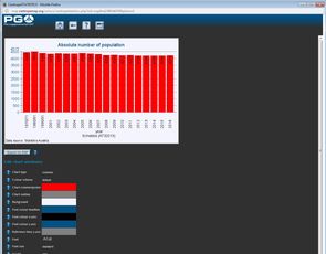
Step 5 of 5: The chart is instantly brought to your screen. Below the chart you can see numerous options to alter the chart's layout. (Fig. 4 below) Use these options if needed and press "Apply to chart" at the very bottom to reload the adapted chart.


